My first project at Hiintern involved enhancing the visual design and usability of the job board website before its launch, as the company leader was concerned that the platform's interface was not resonating with Gen Z users.
My Role
End to end design, Research, Branding, Prototypes, Requirements documentation
Key Results
· The Hiintern website version 2 was launched in Jan 2024. · The investors are big fans of the new brand look. · All Hiintern products implemented the new design language.
Ensure a consistent browsing experience for search results
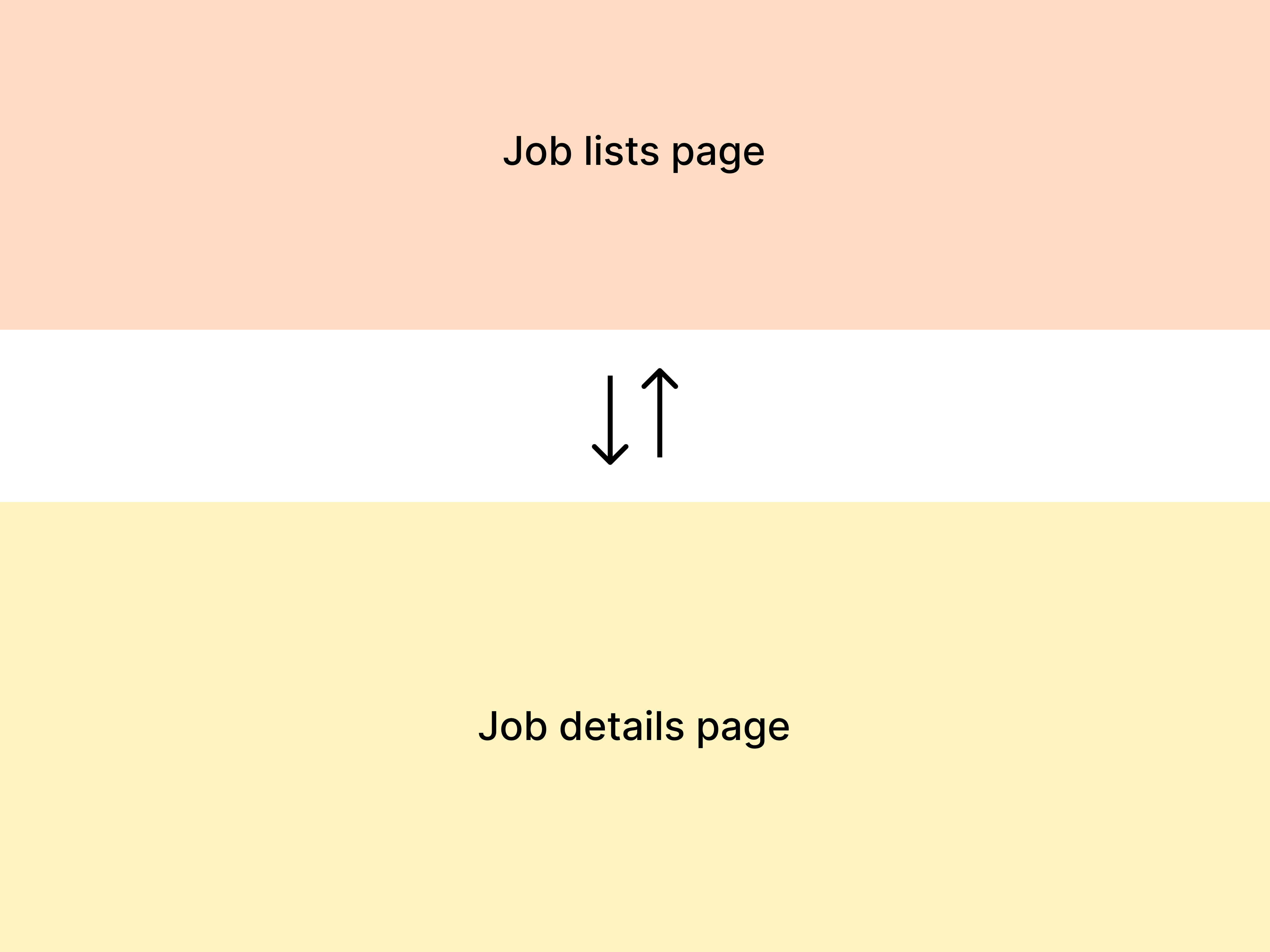
Problems in old design
After searching, users need to repeatedly switch between the job list page and the job detail page, also leading to high interaction costs.
The filter section lacks layout consistency with the search section, along with confusing prompts, inaccuracies, and overly long copywriting.
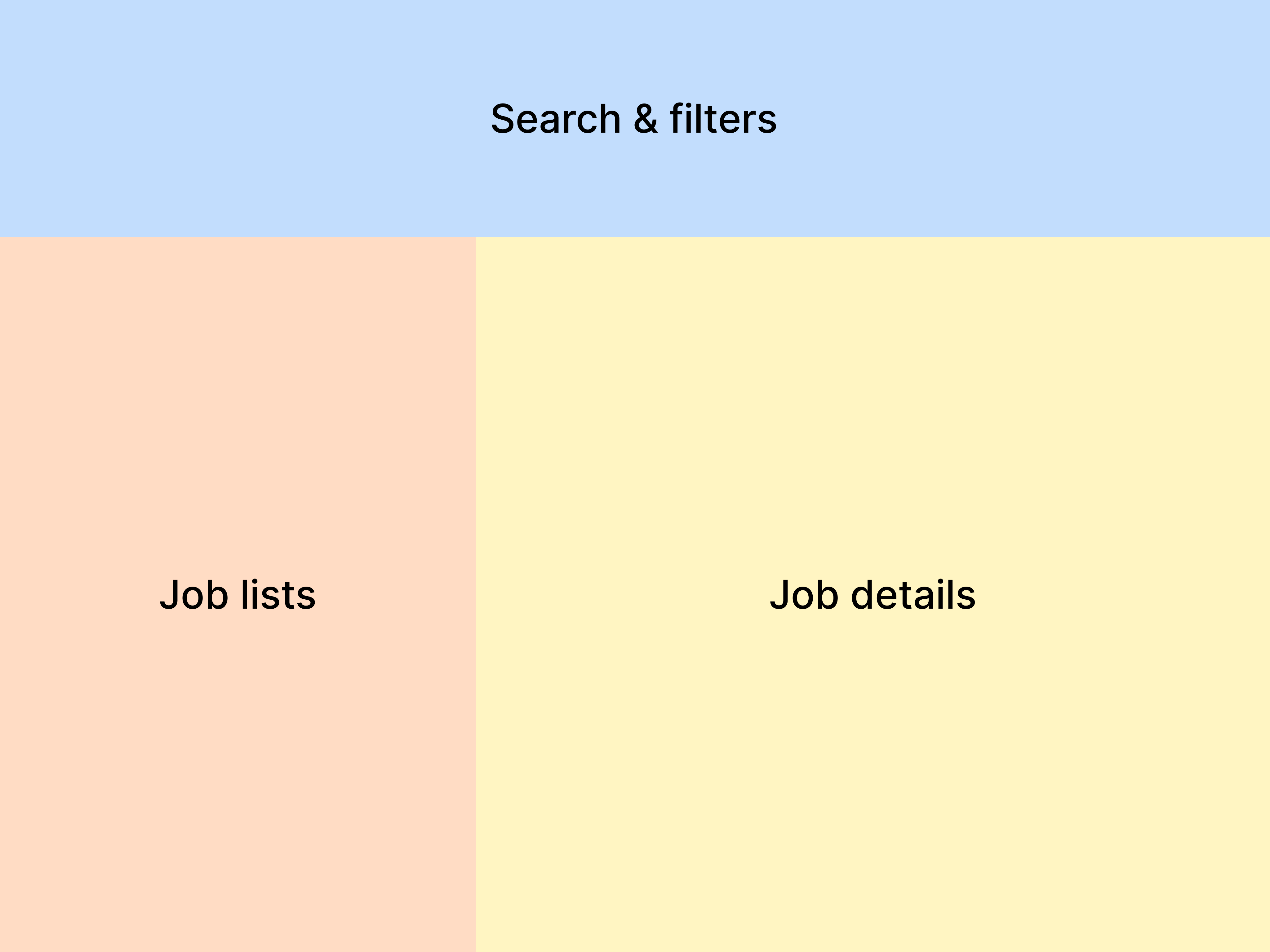
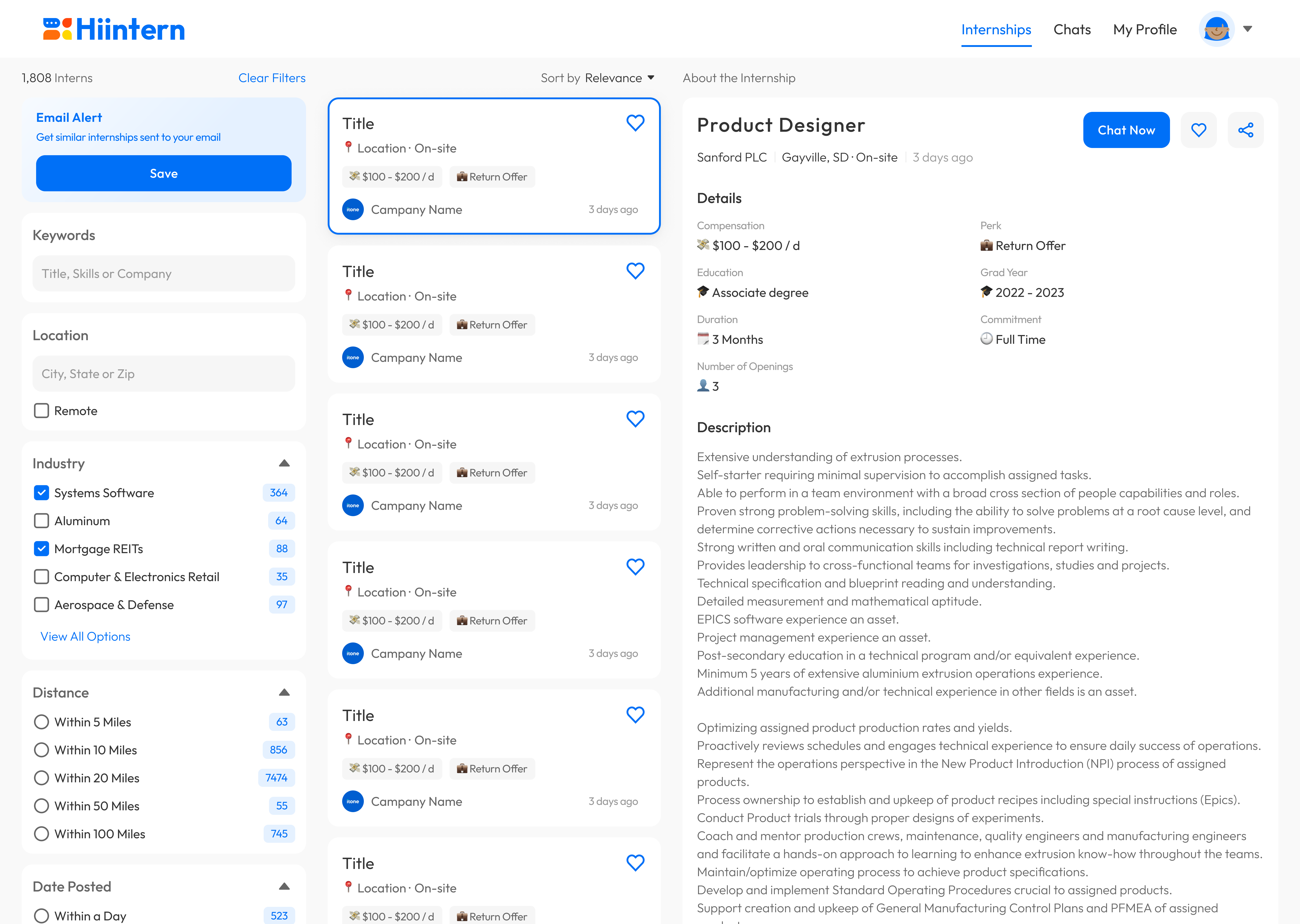
Job lists page
Job details page
Final solution
A horizontal layout allows users to switch between different jobs on one page without interrupting the browsing experience.
Move the filter section from the side to the upper space beneath the search bar for an instant filtering experience.
Approach #1: Heuristic Evaluation
I conducted the heuristic evaluation and identified the issues in the old internship-searching user flow.
Approach #2: Competitive Audit
From the competitive audit, I identified the most common job page layouts.
62.5% of job boards use the horizontal layout
25% of job boards require a page switch when users browse search results
Approach #3: Stakeholder Interviews
I gathered all the stakeholders and conducted interviews to get feedback and identify opportunities for refinement.
In version 1, the search and filter section was positioned on the left side of the page, necessitating users to scroll down to access the entire section. Therefore, I relocated the section to the upper space of the page in version 2, allowing users to adjust their keywords and filters at any point.
Version 1
Version 2
Challenge 2
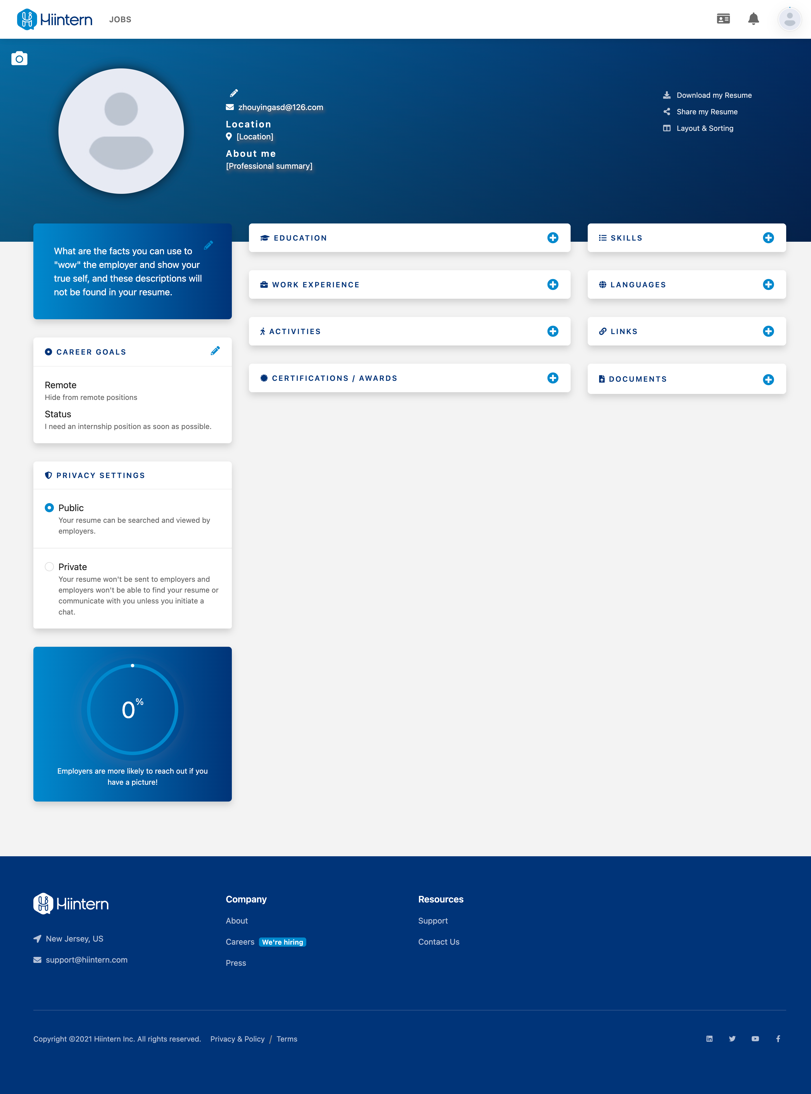
Improve the profile creation experience
Problems in old design
Even though the profile creation task is extensive, there is no help for users to complete it.
Restrictions from the development side, such as preventing users from deleting a single piece of educational content🤔.
Too many sections make it challenging for users to decide where to start, and they lack hierarchy and interrelation.
The clickable areas of the icon buttons are too small, potentially leading to a frustrating experience.
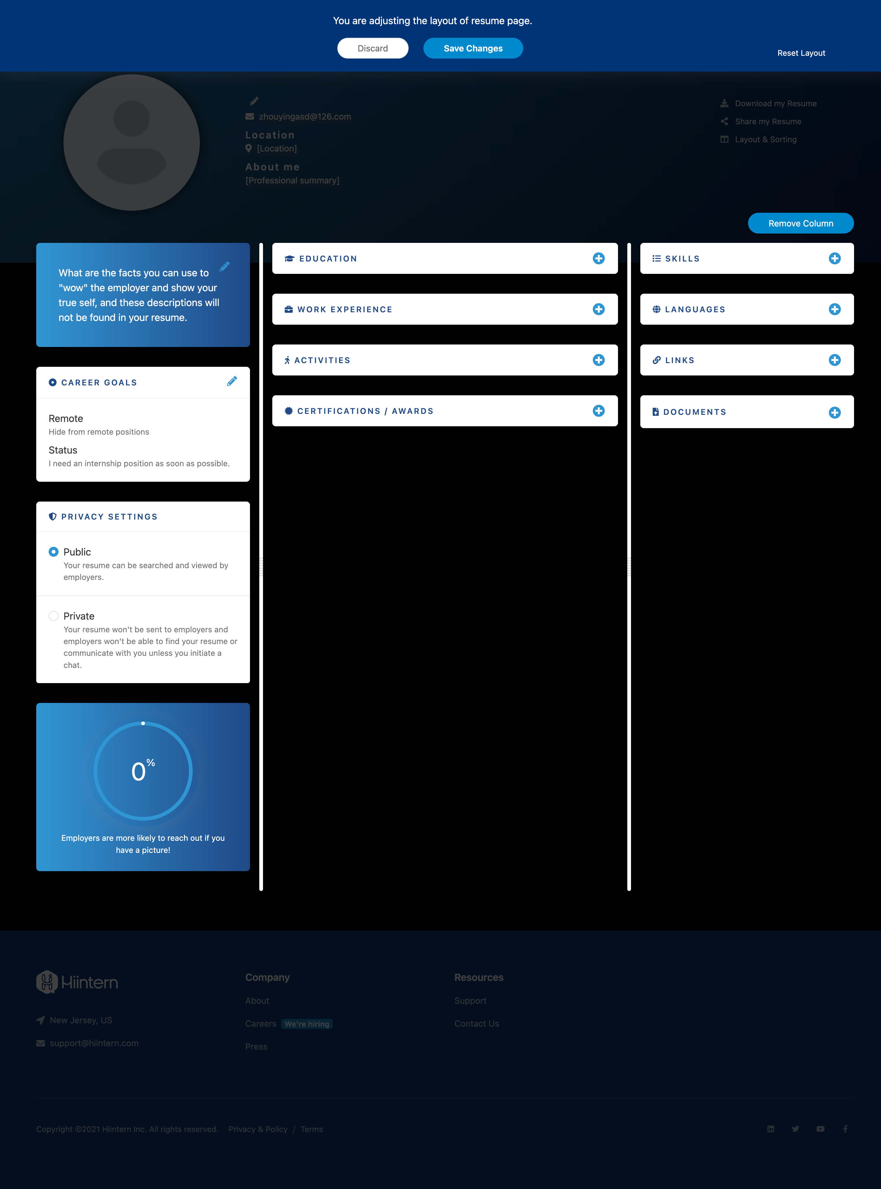
Final solution
Created a checklist to encourage profile completion. Integrated basic forms into the onboarding process to avoid information overload.
Identified the original reasons for these restrictions and persuaded the dev team to remove them for a fair experience.
Reorganized profile sections and allow users to control the visibility of minor content.
Increased the size of clickable areas and incorporated different appearances for various component statuses.
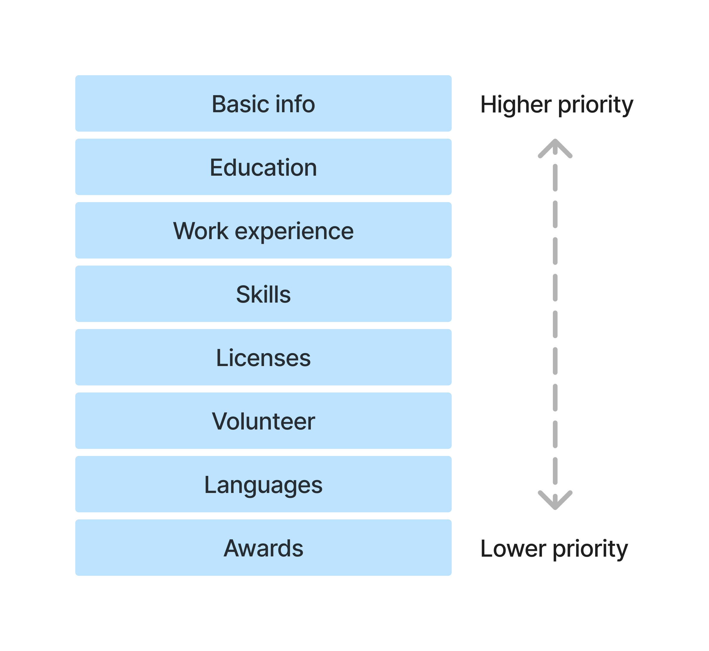
I researched 18 student resumes and 22 student LinkedIn profiles seeking internships, and I conducted a competitive audit to understand the priority of each profile section.
Education, skills, and work experience are essential sections
Education, Skills, Work Experience98%
Licenses, Volunteer, Language, Projects57%
Honors, Featured, Courses, Recommendations34%
Test Scores, Organizations, Publications11%
Tailor the profile for targeted users
The job boards aimed at student groups have specific sections such as volunteer experience and highlight the education section more than the work experience section.
Reduce the difficulty of profile creation
Some job boards separate the profile sections into a static part and an optional part, with the optional part hidden upon the initial landing.
Design decision
I identified the key profile sections and reorganized them to create a consistency throughout.
Sections and priority
Old profile sections
Reorganization
Basic info
Keep
WOW
Remove
Profile privacy
Keep
Profile completion
Keep
Education
Keep
Work experience
Keep
Activities
Replace by Volunteer
Certifications / Awards
Separate into Licenses and Awards
Skills
Move to Work experience
Languages
Keep
Links
Move to Basic info
Documents
Remove
Think beyond the profile sectional division
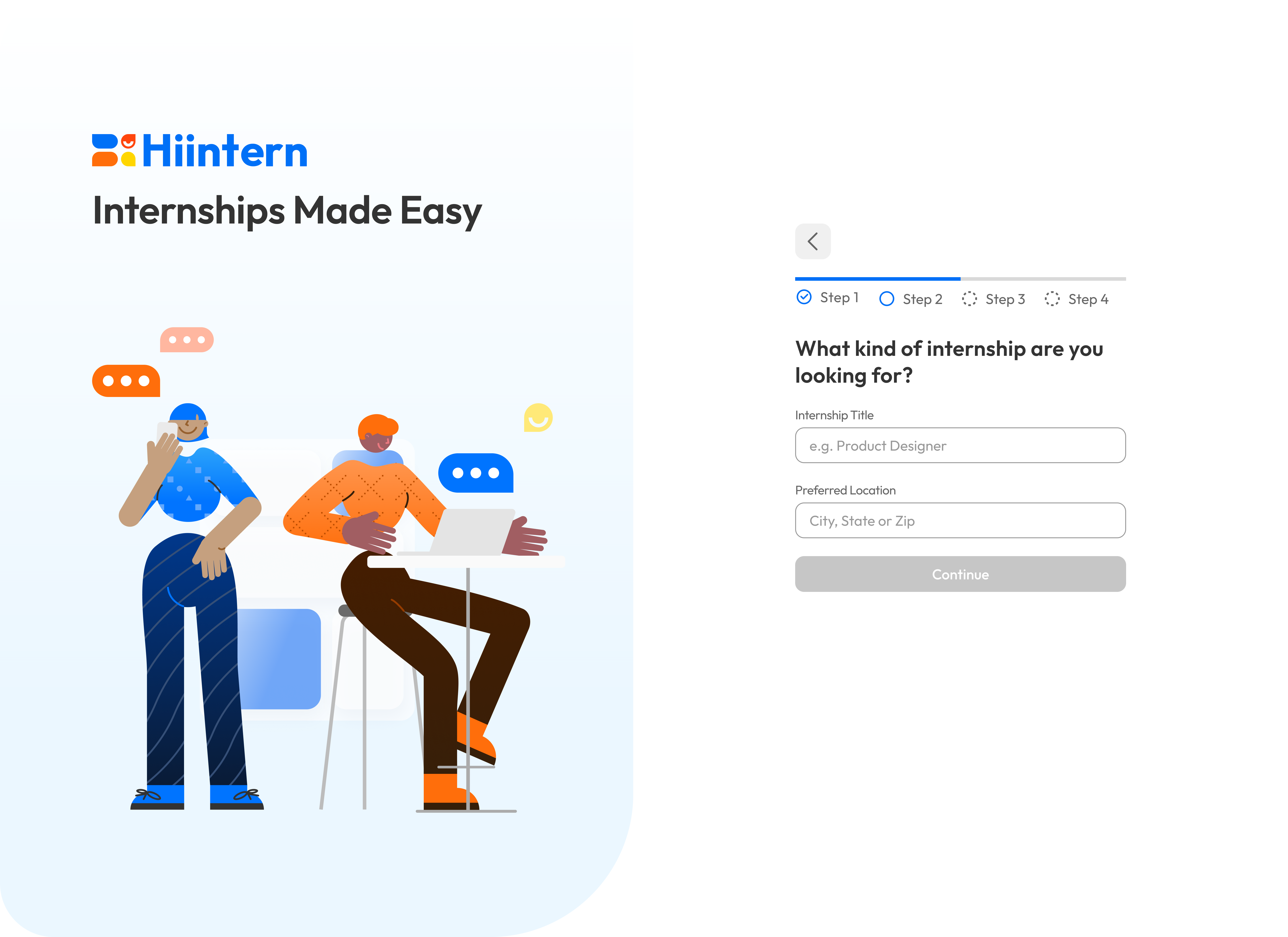
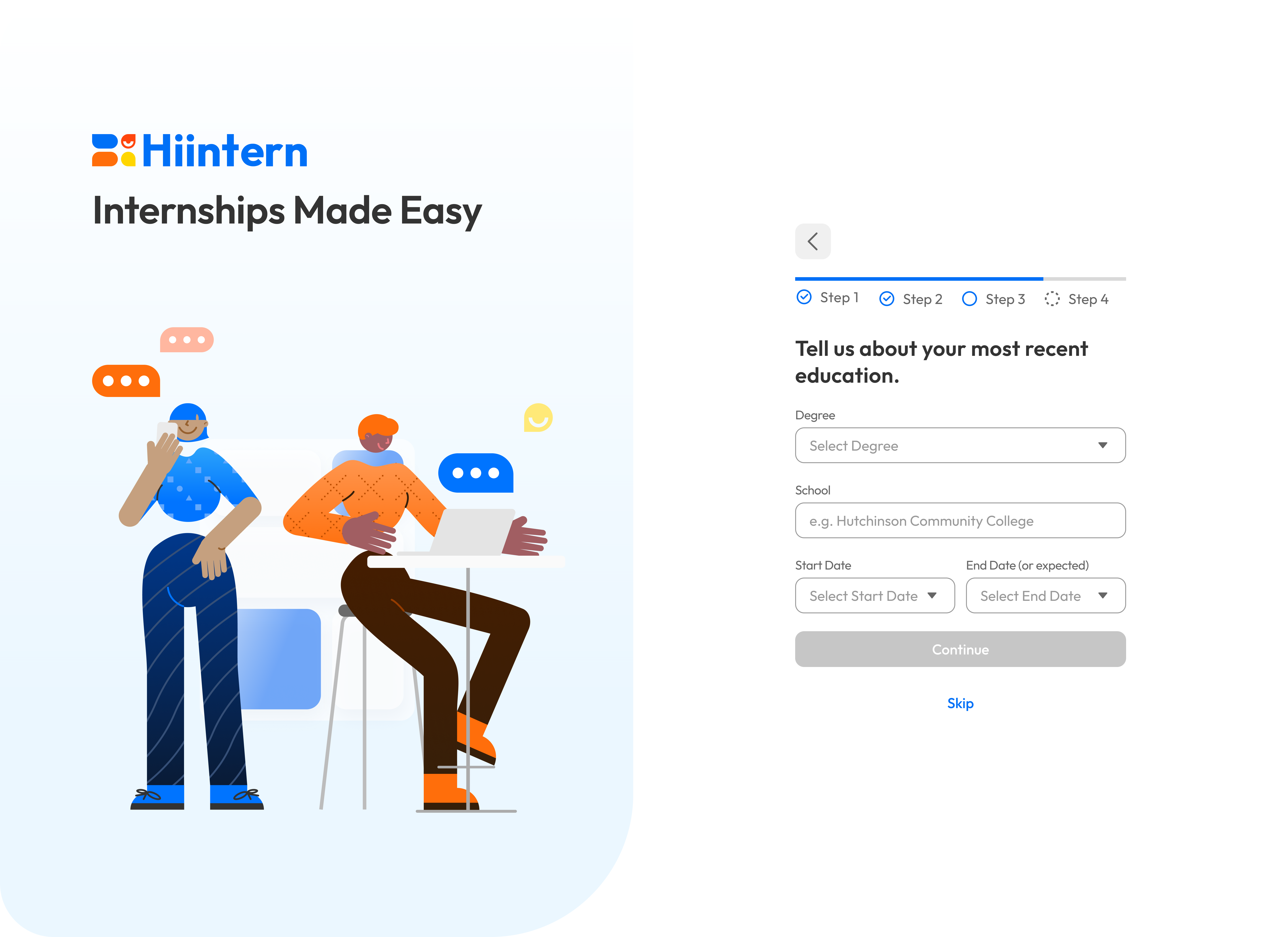
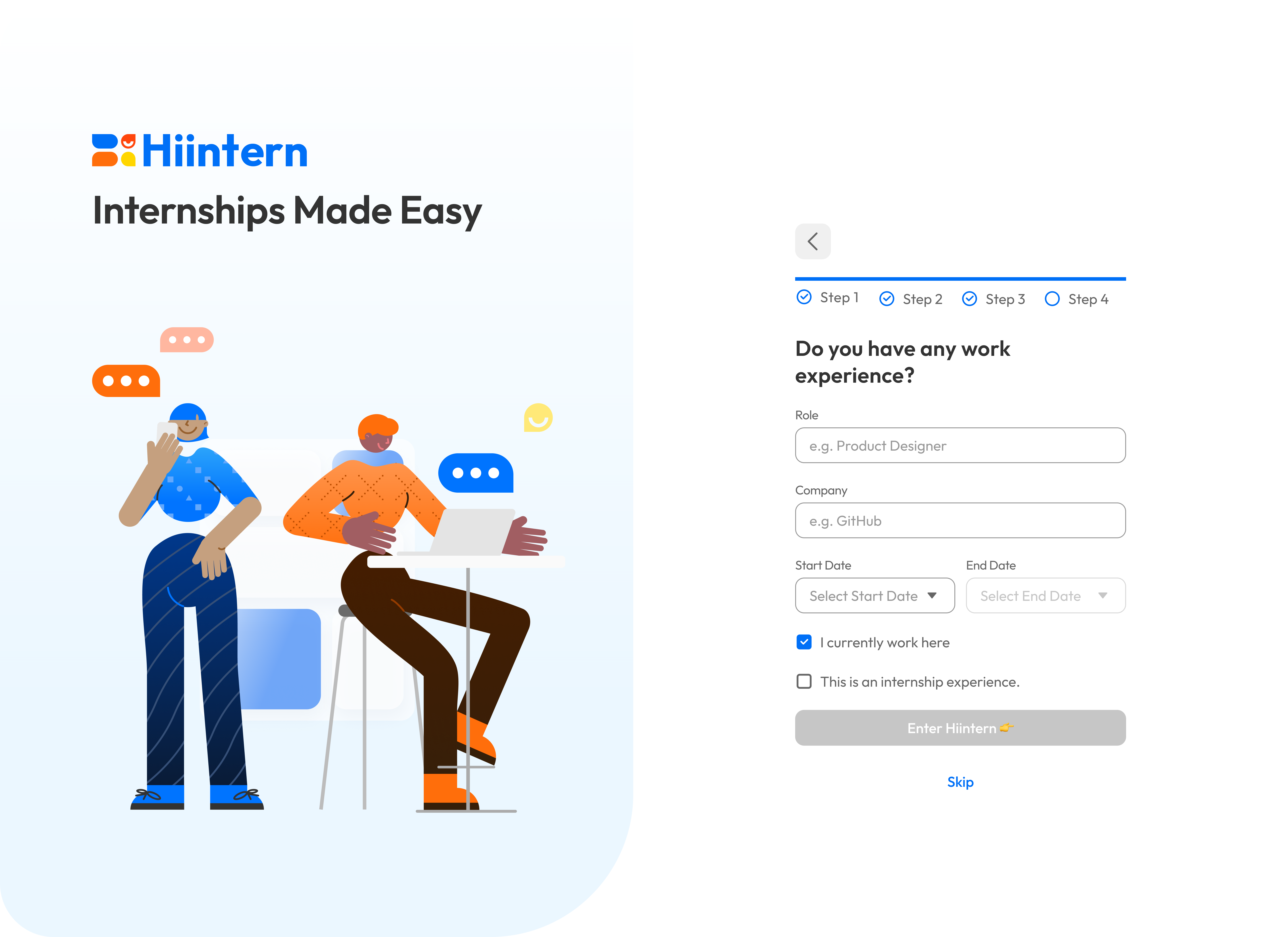
Simply dividing the profile sections into static and optional parts isn’t sufficient. In order to guarantee a seamless profile creation experience, I integrated the basic creation process into the onboarding process, starting from the broader perspective in version 2.4.
Step 1 - Enter basic info
Step 2 - Enter internship interests
Step 3 - Enter recent education
Step 4 - Enter recent work experience
Challenge 3
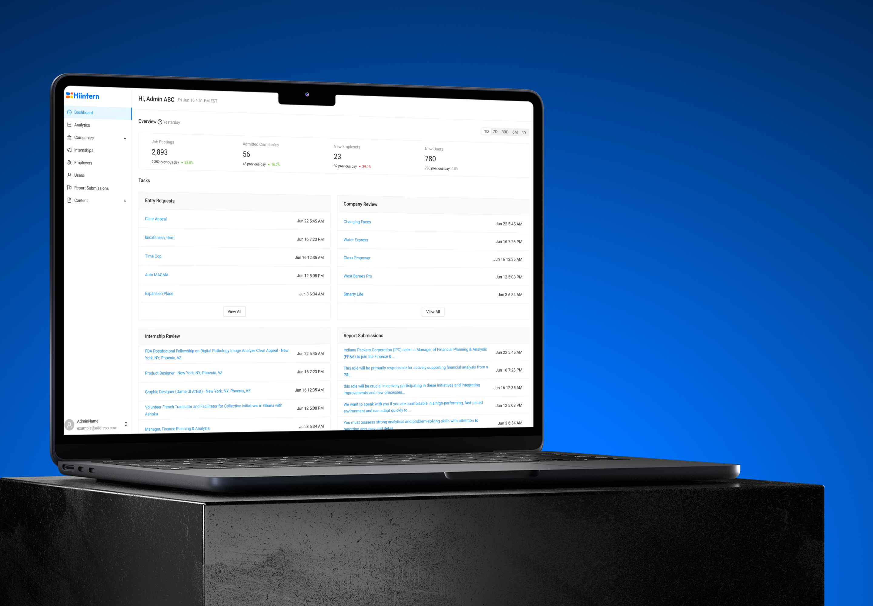
Design a brand new look
Old design
New look
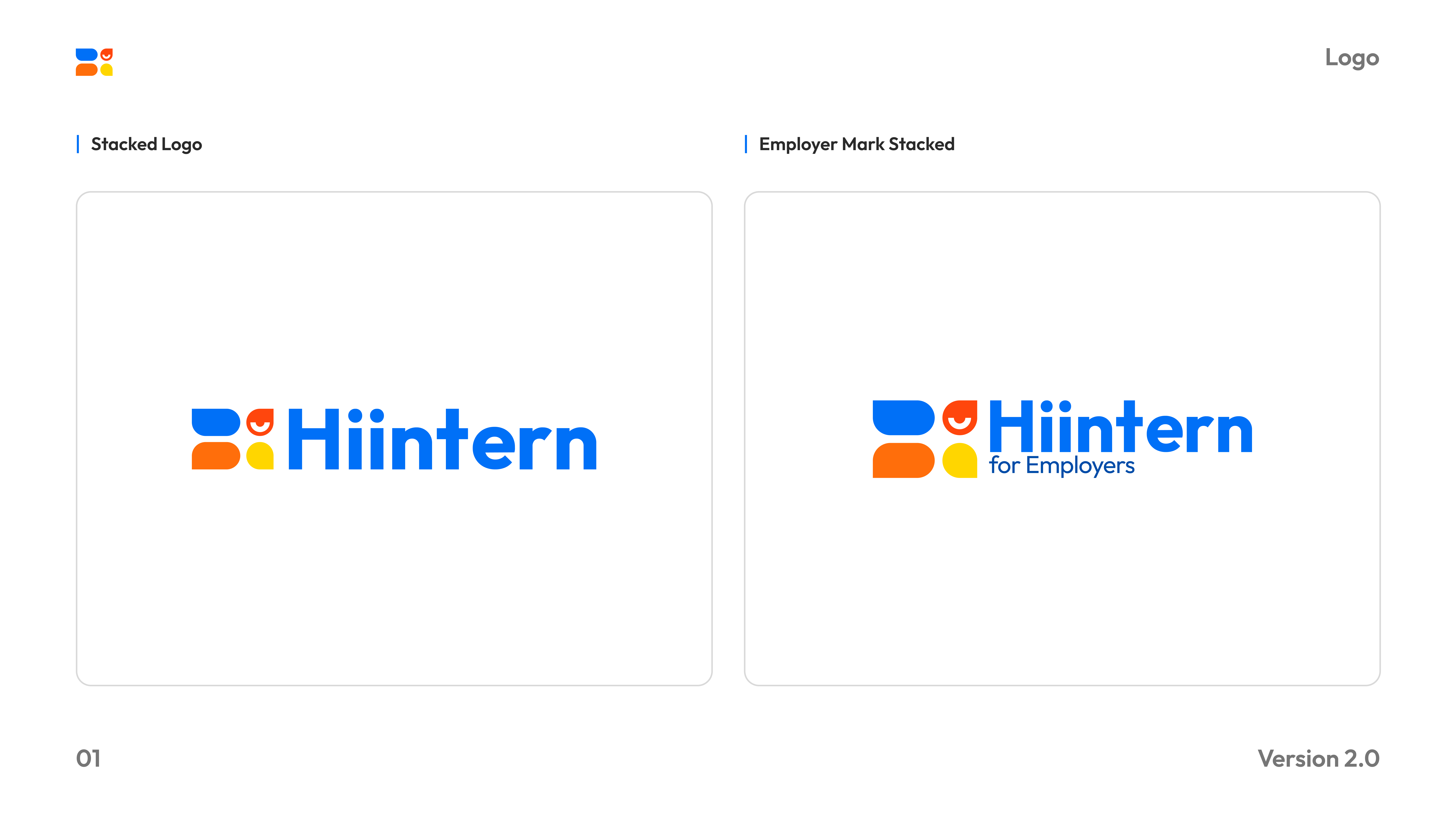
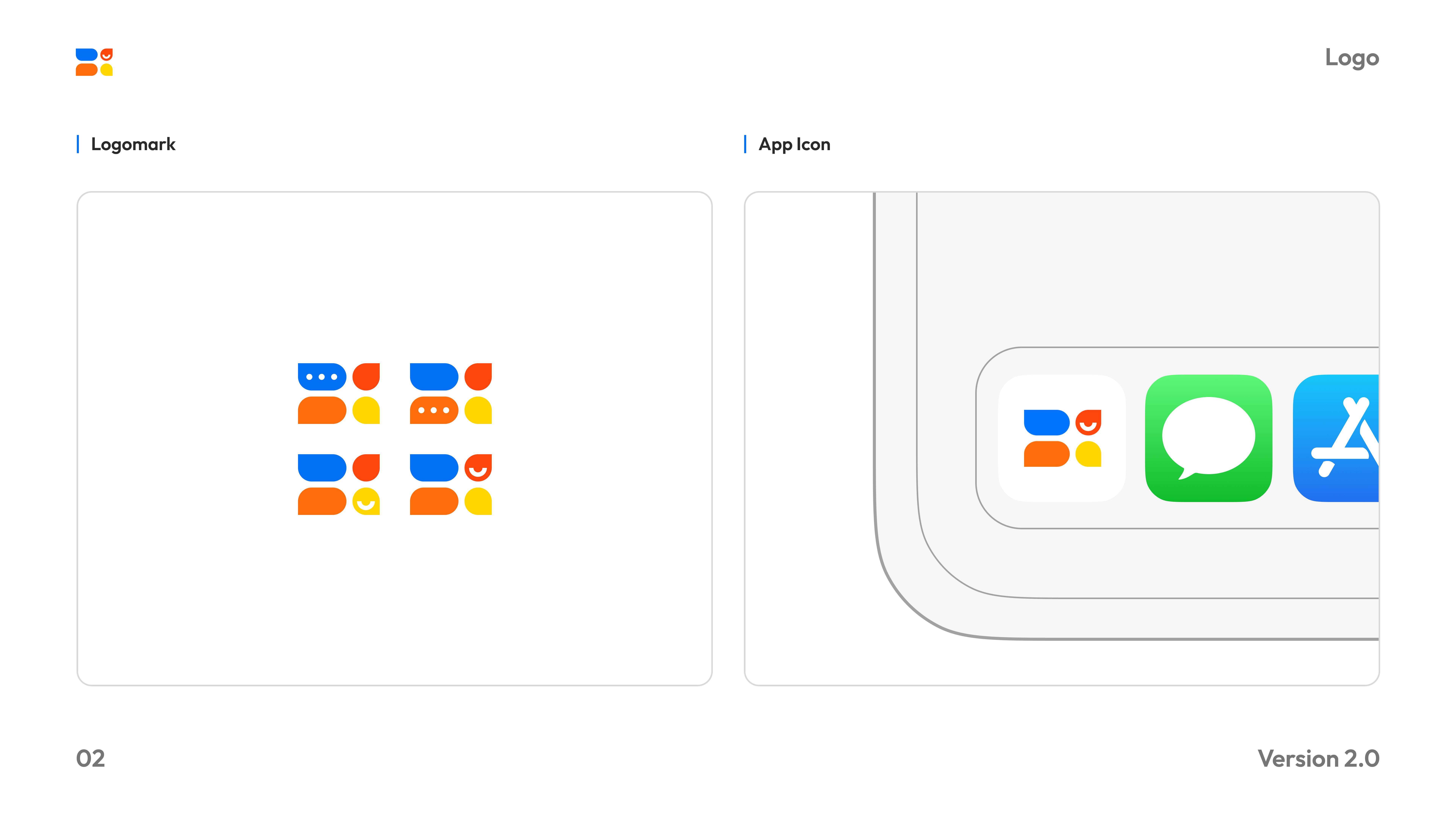
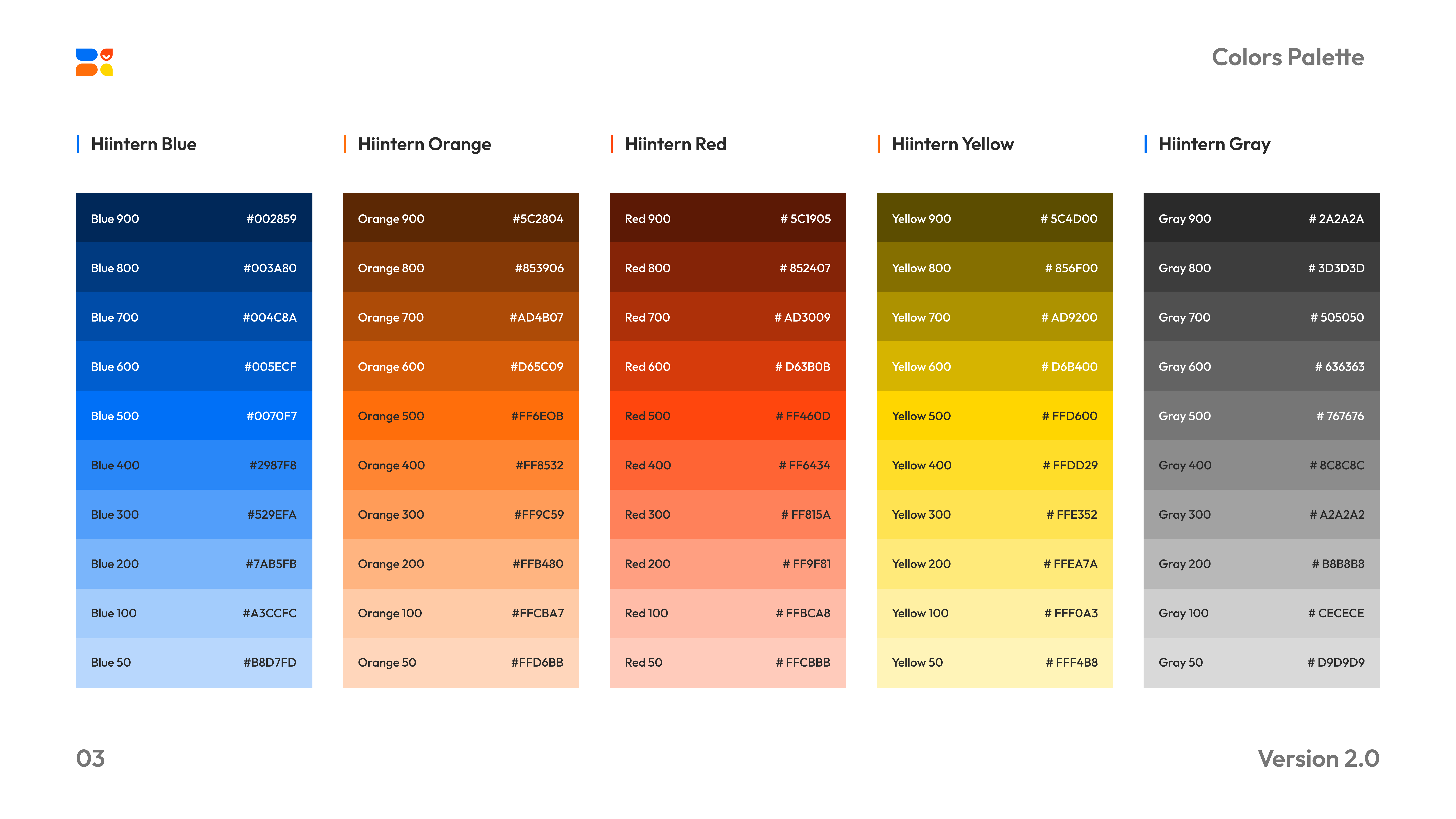
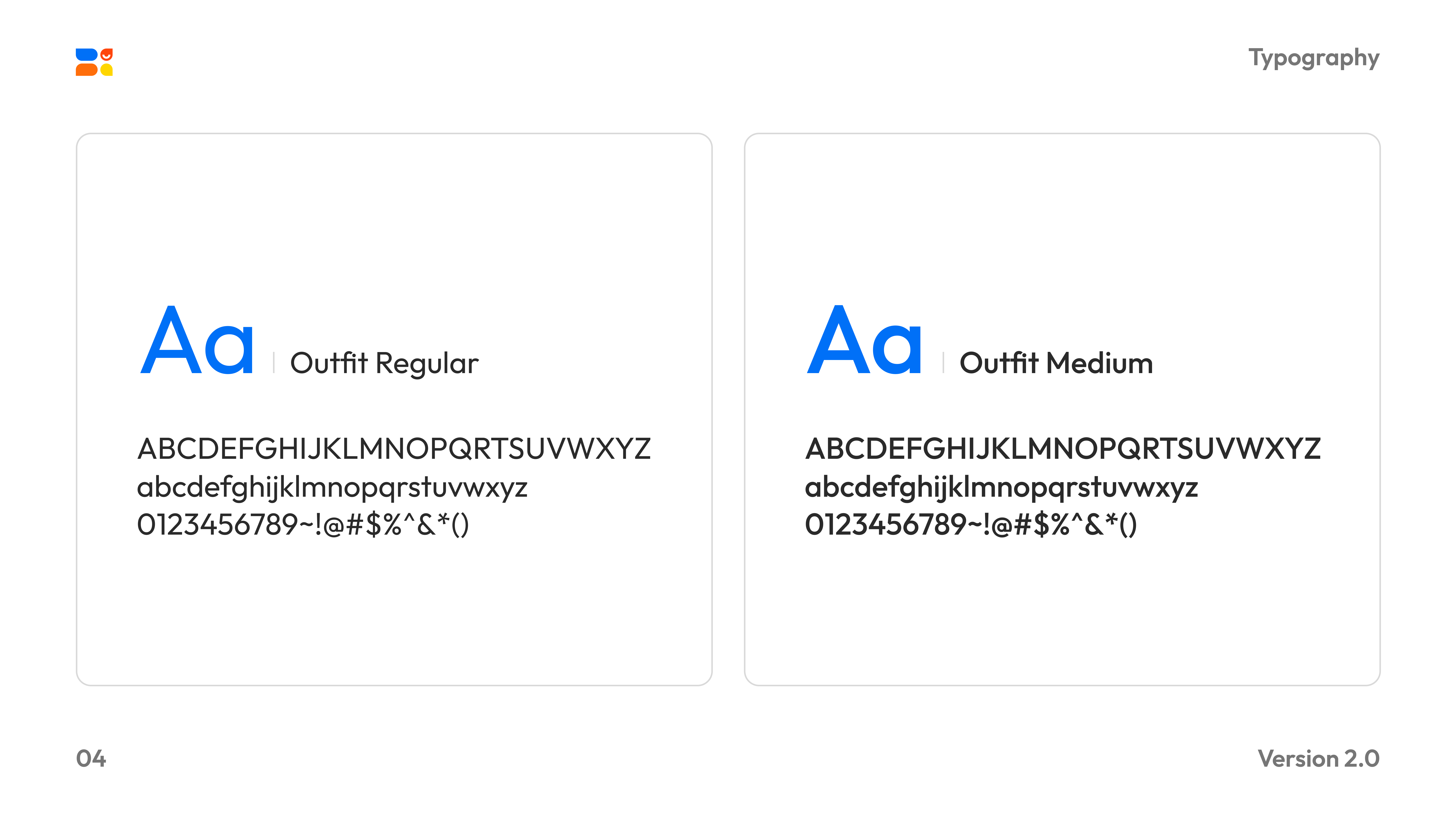
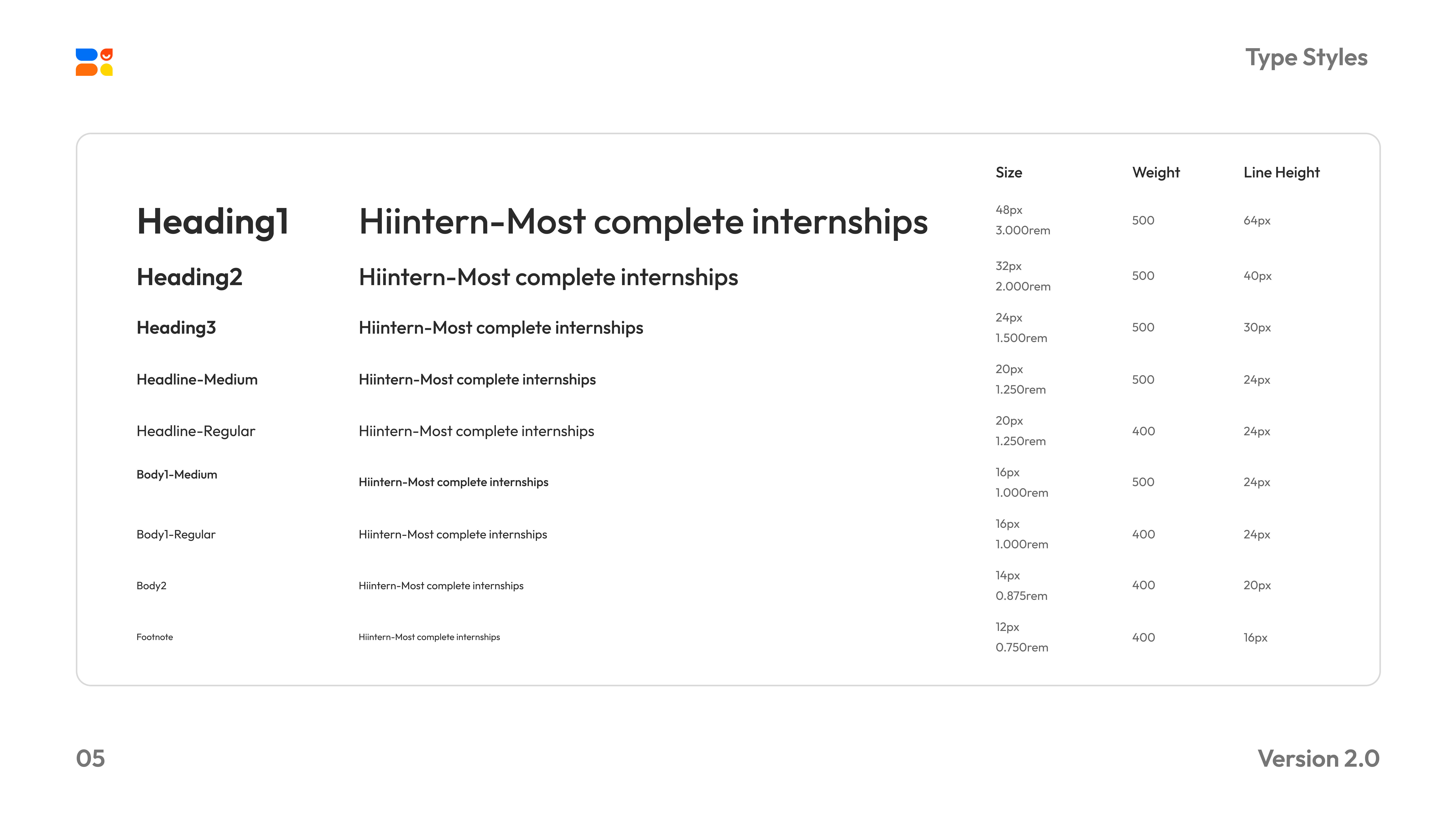
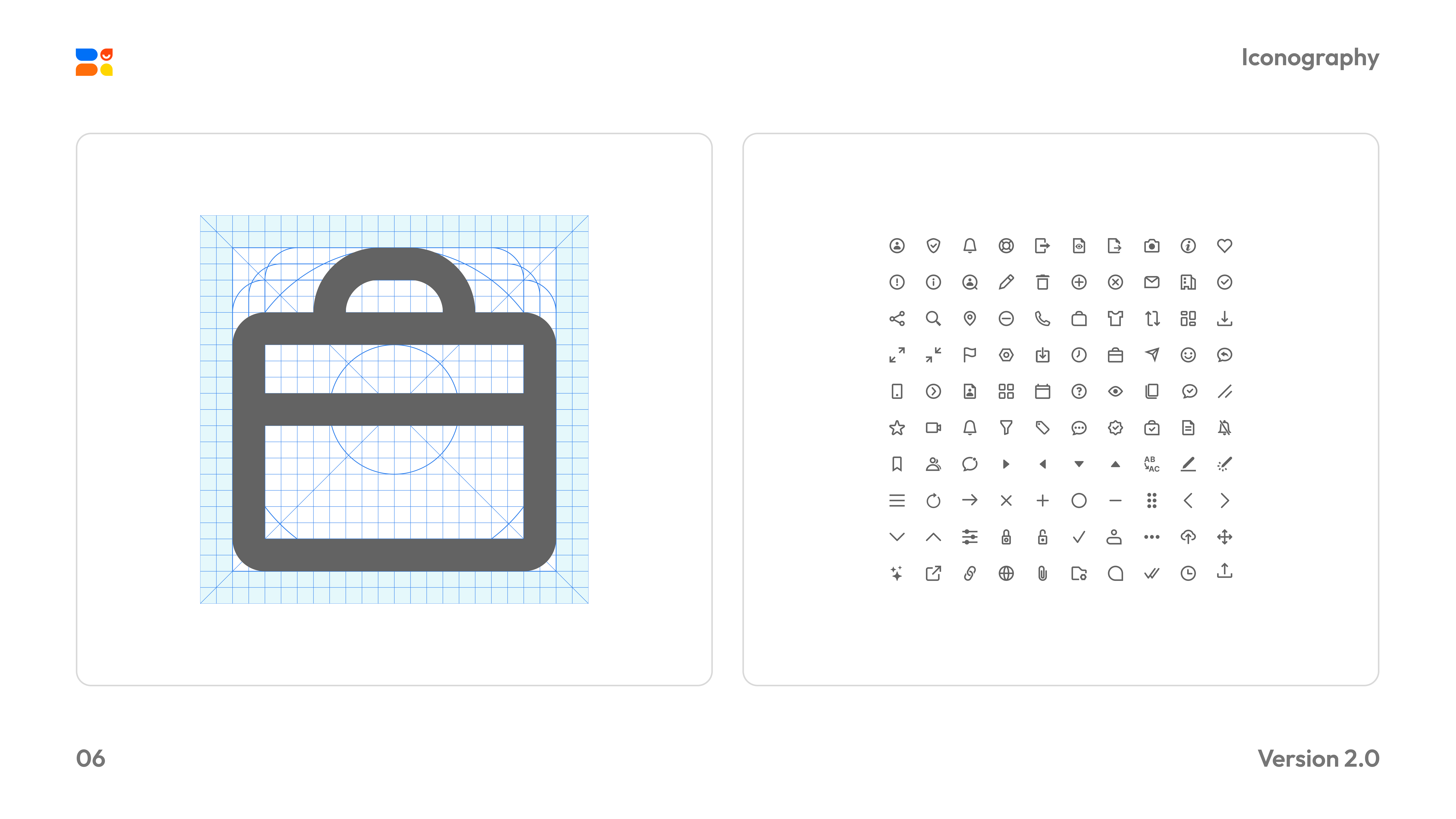
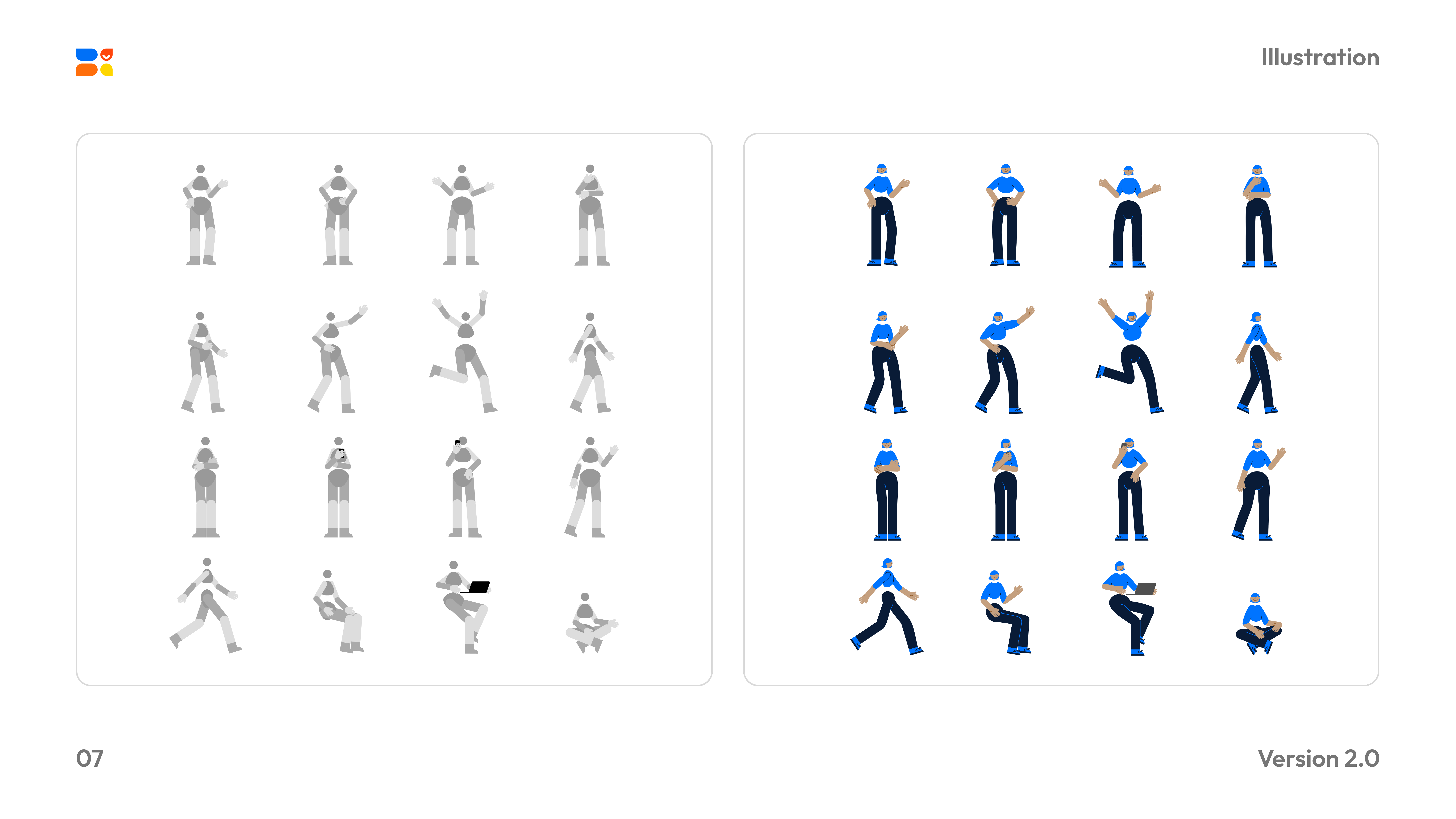
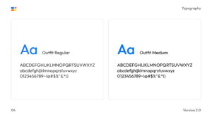
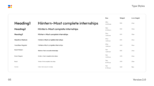
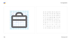
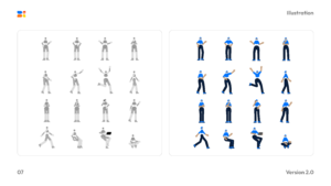
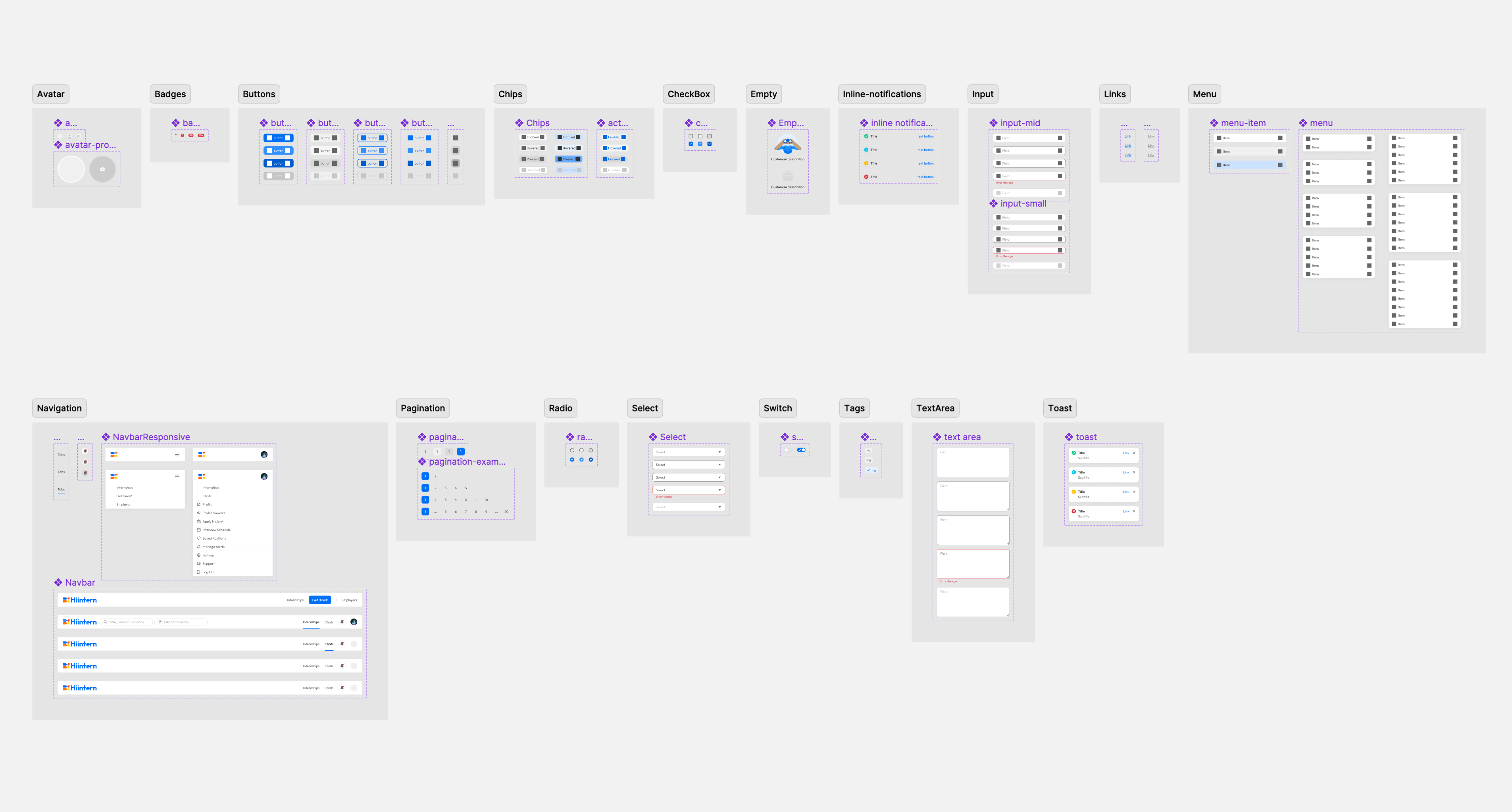
To ensure consistency, I built the components library.